


Honeychrome: 3D plotting

The Honeychrome flow cytometry analysis tool offers the ability to create plug-ins. These are add on tools (bits of computer code) that enable extra functionality. Honeychrome is open-source and written in Python, so anyone can contribute to the project if they want to get involved, and writing your own plug-in probably doesn't even require integration into the main project, provided you're willing to launch Honeychrome from the terminal.
Today let's look at a fun little plug-in that allows you to view your data in three dimensions. This is already included in version 0.8.3 of Honeychrome, which you can download and run as an application.
Why might you want to do this? Well, flow cytometry data pretty much always contains more than two dimensions. We tend to view things on 2D plots because that's what works on computer screens, but in doing so, we don't get as good of an idea of where the boundaries are between populations. Dimensionality reduction tools can help to some extent. As a practical example, imagine you're trying to gate on Tregs using CD127, CD25 and FoxP3. Or perhaps T follicular helper cells using PD-1, CXCR5 and Bcl-6 or ICOS. You might create two sequential 2D biplots to identify the cells you want with some certainty. Some cells would probably incorrectly classified by either gate, and you end up losing cells that should be in the final gate and/or including cells that should be excluded. A three-dimensional plot doesn't fix the gating problem, but does allow you to see just a little bit better whether the positions you've chosen are correct or whether you're getting some contaminating population intruding. Mostly, though, it's just fun to look at.
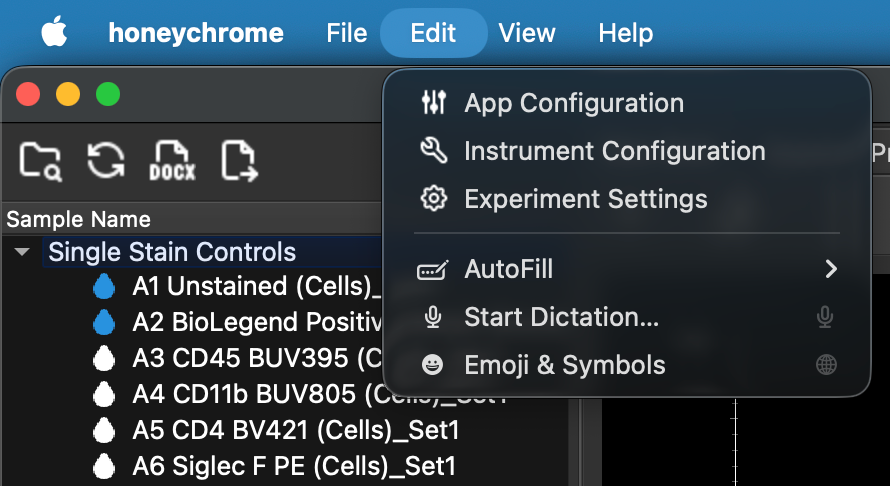
To enable the plugin, go to Edit/App Configuration and tick the box for the 3D plotting plugin (plot_3d_tab):

The app will do a quick reset to load the plugin, and then you should see a new "3D Plots" tab appear. Click on the Unmixed Data tab to make sure you've set up the unmixing/compensation, then navigate to the 3D Plots tab.
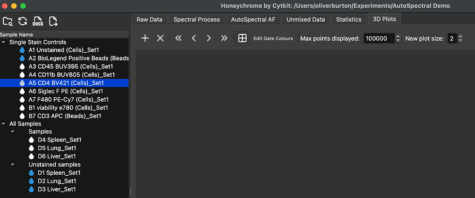
The tab will be empty at first. Click the "+" symbol to add a plot.

Pick which markers you want to display on the plot, and the gate you want to use. The gating hierarchy is whatever you've set up in the Unmixed Data tab, so if you haven't set up the gates you want, go there first and do that.

Once you've got the configuration you want, click "Create Plot". Select the sample you want to display from the sidebar (changing which one is selected changes which data are displayed on the plot).

At the top, you can change which gate is used:

And you can also change whether it colours by density or by gate. Here I've selected a low level gate (viable CD45+ cells), so it colours all downstream gates from there:

I don't like that grey. The colours can be changed:


At the bottom, you can change which parameters are displayed. You can also make another plot, if you prefer.

And you can drag, twirl and zoom using your mouse. This doesn't currently work well on a Mac when using the trackpad, so use a mouse if you can. Maybe that can be fixed later.
By the way, it appears that FlowJo also has a 3D viewer. Instructions here and here. Personally, I couldn't find these controls on FlowJo, either version 10.10.1 or 10.10.2 on MacOS or Windows 11. I'll update the instructions here when I hear back from tech support.

In FCS Express, you can do a type of 3D plot called a surface plot. This gives you a topological relief surface over the 2D plot.


Comments